Free Website & SEO Audit· See exactly where you're losing traffic, leads, and revenueGet Your Free Audit
Case StudiesFormula Wellness
formula-wellness logo

An editorial brand and custom site for a modern wellness practice.

Health & Wellness · Brand · Custom WordPressMulti-location · Texasformulawellness.com

Formula Wellness is a modern wellness brand built around hormone optimization, IV therapy, weight management, and longevity care. They came to Think Cre8tive looking for an identity and a digital home that felt as considered as the care itself — refined, editorial, and unmistakably premium. What we delivered is a complete brand and custom WordPress experience engineered to convert serious clients, support multiple locations, and grow with the practice.

formula-wellness website screenshot
formula-wellness logo
Editorial
Brand identity
type · palette · photography
Custom
WordPress build
Multi-loc
Location architecture
Booking-ready
Conversion-first UX
Services Provided

The full brand and build behind Formula Wellness.

Brand Identity & Visual System
Editorial Art Direction
Custom WordPress Design & Development
Treatment & Service Architecture
Photography Direction
Conversion-Focused UX
Location & Booking System
SEO-Optimized Architecture
The Challenge

A premium wellness practice surrounded by interchangeable competitors.

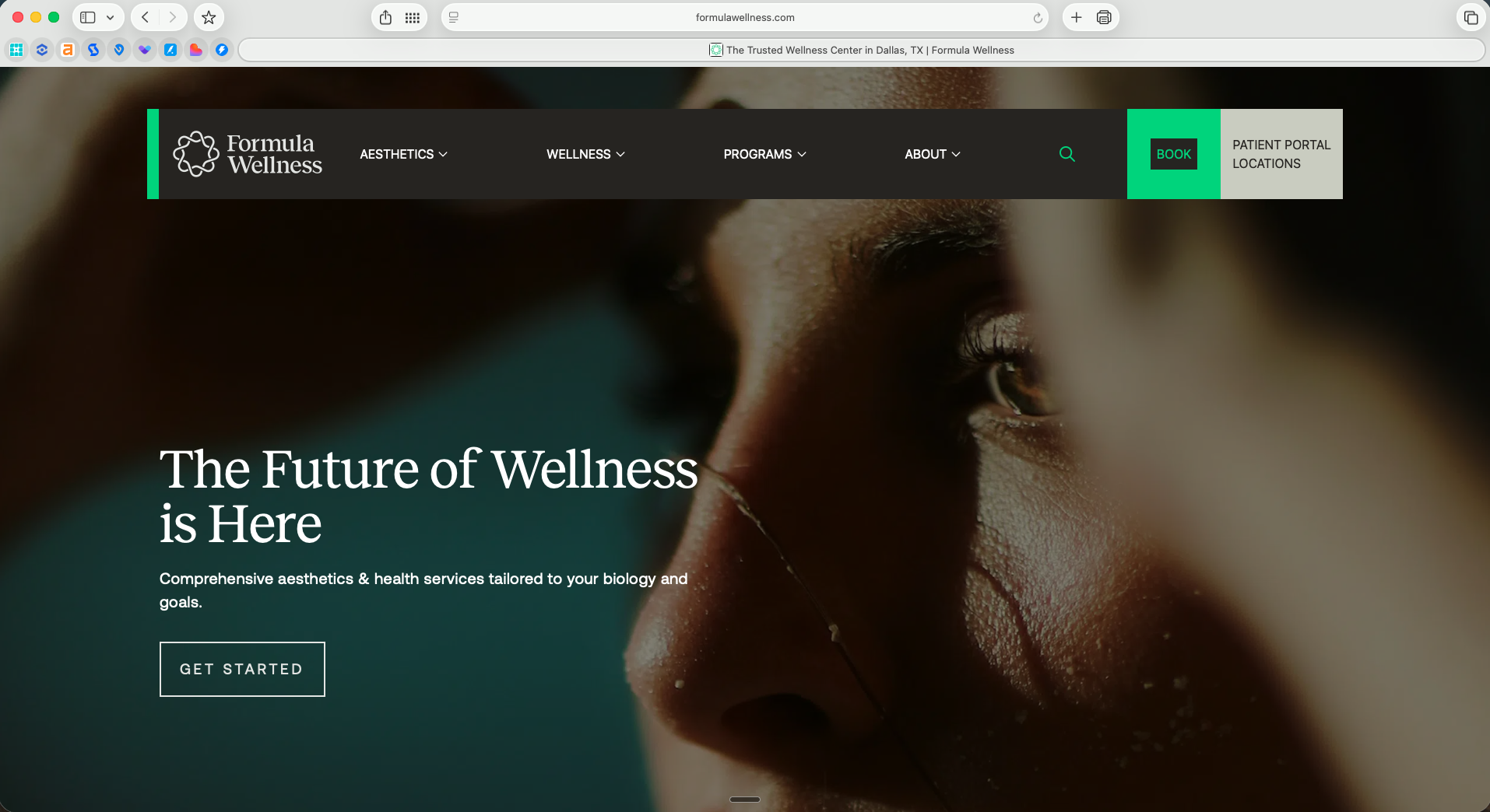
The wellness category is loud, generic, and mostly indistinguishable — neon gradients, stock photography, and the same five layouts. Formula needed to feel like the most considered option in the category from the first second a prospect lands.

01

A crowded med-spa and wellness market with little visual differentiation.

02

Multiple service lines — hormone, IV, weight, longevity — needing clear architecture.

03

Premium audiences that judge instantly on typography, photography, and tone.

04

Multiple locations to launch under a single, unified brand system.

05

Booking and inquiry flows that needed to convert without feeling like a funnel.

The Approach

Treat the brand like the practice — meticulous, editorial, and quietly confident.

01

Identity built on restraint

A refined visual system — serif/sans pairing, warm neutrals, generous whitespace — that signals premium without shouting.

Editorial typography pairing tuned for long-form treatment pages
Warm, neutral palette with disciplined accent usage
Logo, mark, and supporting graphic language across every touchpoint
Photography direction that replaces stock with a unified aesthetic
02

Treatment storytelling as the spine

Every service has its own page architecture so prospects understand the science, the experience, and the outcome before they book.

Service-page templates for hormone, IV, weight, and longevity programs
Protocol, ingredient, and benefit modules that read editorial, not promotional
FAQ, science, and pricing sections engineered to remove the last objection
Clear cross-linking between programs that complement each other
03

A booking flow that respects the client

Booking-first UX without the funnel feel — every CTA is calm, contextual, and within one tap from any page.

Persistent booking entry points without aggressive popups
Service-aware booking — context follows the client into the form
Trust signals (providers, credentials, locations) where decisions get made
Mobile-first interaction tuned for the way wellness clients actually browse
04

Multi-location, one brand

A location system that scales without diluting the identity — every market feels native, never franchise.

Per-location pages with localized hours, providers, and contact
Shared service catalog with location-aware availability
Local SEO architecture across every market
A system the team can extend as new locations come online
The standard
Editorial

an editorial brand system — typography, palette, photography, voice — paired with a custom WordPress build engineered for booking conversion across every Formula Wellness location.

The Results

A brand and site that finally match the standard of the care.

Brand & system
Editorial
Identity system
type · palette · photography
Unified
Voice across every touchpoint
Custom
WordPress architecture
Scalable
Location system
Experience & business outcomes
Booking-first
Conversion UX
without funnel feel
Multi-loc
Location architecture live
Premium
Brand perception in a noisy category
Ongoing
Partnership
stewarded by Think Cre8tive
What Makes This Different

Most wellness sites look like ads. Formula Wellness looks like a magazine. That single decision — to treat the brand as editorial rather than promotional — changes everything downstream: the prospects who arrive, the questions they bring, and the value they place on the work. The site doesn't sell harder than the competition. It signals, quietly and immediately, that this practice is the most considered option in the room.

Want a wellness brand that doesn't look like every other wellness brand?

Start a projectSee more case studies